This week, we have an assortment of feature updates to bring the speed of your workflow to a boil. These are all quality-of-life tweaks to improve the app’s functionality and help you handle the daily grind at record speed, all while keeping your backoffice kitchen clean and tidy. From UI changes to PO additions, there’s a little something here for everyone to eat up.
The apple of my UI (and PO)
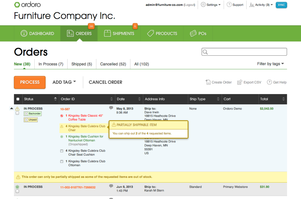
Now that you can delete both tags and return labels within the UI, it’s that much better. If you no longer need to have a specific tag, and you’re getting tired of the long list, delete it as you please: 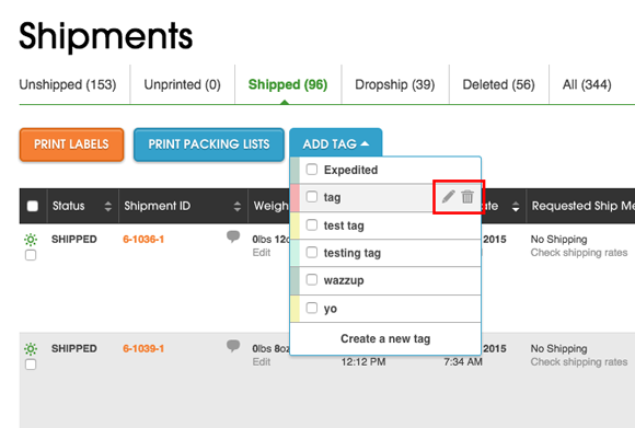
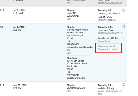
The same goes for return labels. When that in-need-of-return customer is taken care of, smack the delete button and enjoy the free space:
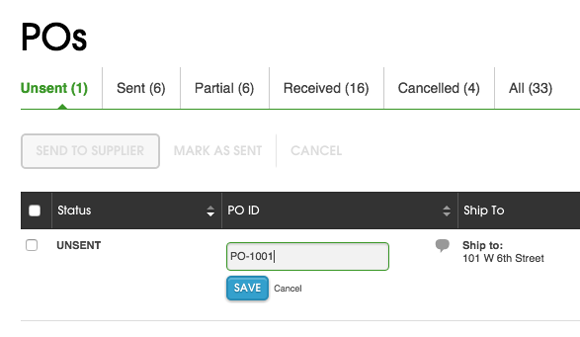
And if you don’t like the look of a certain PO number for whatever reason, change it – you’re the boss:
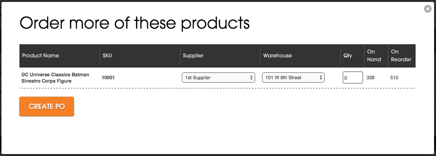
Creating POs also now shows inventory quantity information on the side, whether it’s amount on hand or on reorder:
But wait there’s more!
To get more done at once, make use of a new feature that allows you to select multiple checkboxes at once. Simply hold down your shift key and click away to make more changes in less time. And when you’re assigning your suppliers, you can now set the minimum order quantity to one by default. Lastly – to know where your precious inventory is at all times, it’s possible to see the location of a product within a warehouse when you create a product report.
And this is only the first meal of updates. Look forward to more in the coming weeks!

