This is a guest post from Alice at Beeketing – a Marketing Automation Platform for online stores.
The thing about trends is that they are never stagnant, especially in the digital world of e-Commerce. With the year 2015 behind us and 2016 quickly gaining pace, it is high time for your company to pick up stride and adapt to the fast-shifting preferences of your online market. Statistical forecasts on the sales performance of the E-commerce industry in the USA reveal a projected growth of 12.75%–from 492.07 billion US dollars to 554.81 billion. Your adaptability to the shifting virtual landscape is thus crucial if you want to take advantage of that upward trend and reach your target conversion rate and projected annual sales. Hence, here are the 5 major e-commerce guidelines to keep up with the current:
1. Play with the eyes–be catchy!
You definitely have gone enough in online selling to figure out the importance of visuals. It is no longer uncommon for many sites to feature a huge photo in their homepage so that it would fill almost, if not, the entire screen. You also have to pay attention to the font that you use, as your font goes along with your other visual elements. Further, you do not want your layout to look so contrasting. Otherwise it would discourage visitors from continuing to browse through your page. Here are some visually on point webpages to take pointers on:
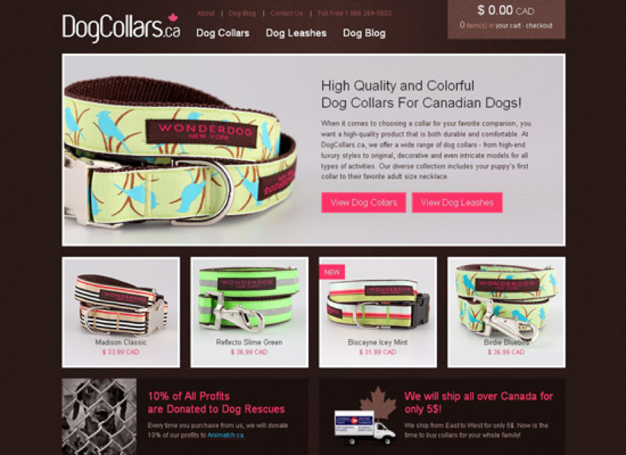
DogCollars.ca
Here is a simple HTML website sample. With a neat grid-based layout, a warm chocolate color, and big high-quality thumbnails, it captures the interest of every dog lover. The design is minimalist but not plain giving the visitors assurance of a satisfying shopping experience.
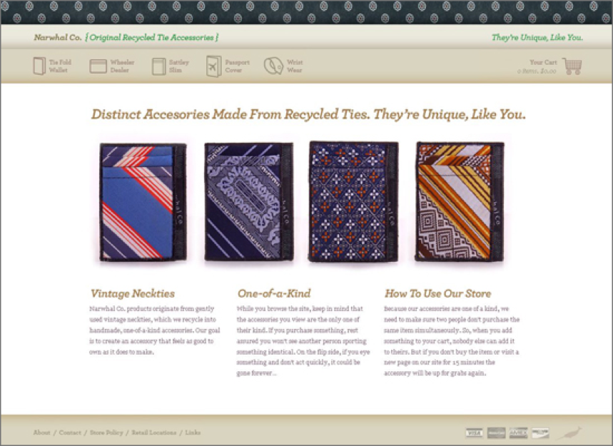
Narwhal Co.
Selling something unconventional like accessories made from recycled ties? You sure need a good visuals to sell that -ish! Narwhal Co. does just that. The tie theme in the website’s header and footer, the stylish icons and the inventive product slideshow on the main page give this design a special flavor.
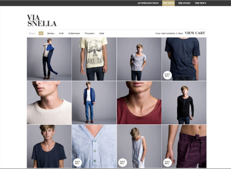
Via Snella
The website of Swedish male fashion brand Via Snella is clean both in design and usability. The product gallery is not cluttered with the superfluous navigation bars, announcements and slideshows that are typical of large comprehensive online stores. Instead, the background of the fancy product thumbnail grid is made up of a classic black and white scheme, along with austere typography and plenty of white space giving it a classy masculine atmosphere.
Figuring out the most captivating webpage for your online store may be quite tricky in the beginning. You may perform A/B Testing strategy in case you’re stuck with two designs and you do not know which one to employ. But before employing anything on your design strategy, keep in mind that the main goal of making an attractive web page is to generate sales. Hence, revolve your design process around this principle.
2. Give great deals!
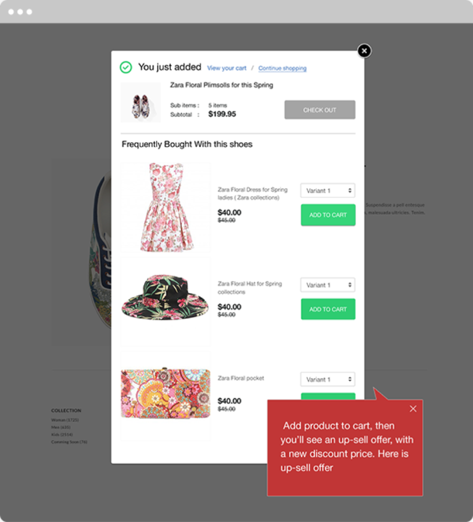
Up-sell and cross-sell strategies are gaining popularity nowadays among ecommerce sites. These are the major yet subtle ways to encourage customers to purchase products they might not originally intend to avail.
- Up-sell: on a minimum additional fee, you offer your customer an upgrade of a product they are about to check out.
- Cross-sell: it is the art of offering discounted products simply because it is closely related to an item in your customer’s cart.
However, the art of up and cross selling may be pretty tricky. For one thing, you have to figure out just exactly what product would grab your customer’s interest. A wrong product promotion may mean losing the sales altogether instead of gaining more. To help you jumpstart your way to this duo strategy, run your online store alongside the Boost Sales App. It helps offering up and cross selling in an instant, thus giving your customers a flattering feeling brought forth by a good customer service – a service sensitive to their needs.
3. Pop the sales up
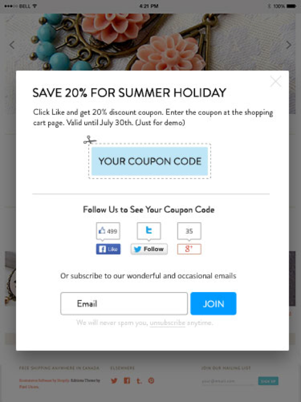
Layout your site and provide content with your target market in mind. After all, you do not only aim to attract visitors–you aim to convert those visits into sales. How do you do that? Narrow down on your target market. A way to do that is by investing on pop-ups. You might be thinking that pop-ups are only most likely to drive potential customers away from your site. However, the trend these days show an increase in their popularity. To avoid annoying your visitors, though, do make sure to tailor your promotions and offers to appeal to the specific audience you are targeting. Whether it’s offering a discount or giving away a freebie, pop-ups can work to increase your subscribers to whom you could regularly send newsletters and other promotions, thereby increasing your chances of a conversion.
4. Provide immediate customer service
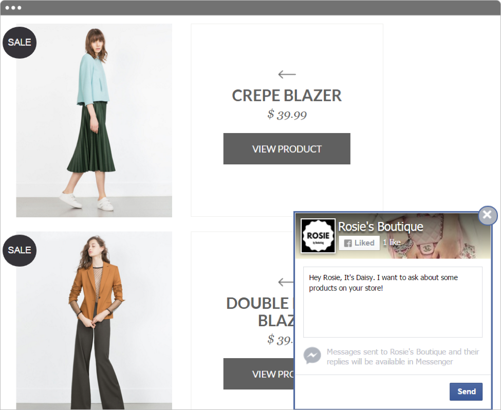
You most likely do not relish the experience of the long wait, and the chances that you will be going back to that store or place anytime soon are very low. Neither does your e-Commerce customers. In e-Commerce, you need to engage with your customers to some extent and do so at a highly convenient and accessible manner if you want to increase the likelihood of a conversion.
Right now, Facebook Messenger is the fastest, most personal and most influential way to provide live customer support. Thanks to modern technology, that is now made easy. In fact, you could make use of a highly-effective app, Quick Facebook Live Chat, so that you could easily communicate with your customers should they have any concerns. It won’t take you too long in wandering around E-Commerce forums to know this latest fuzz — leveraging Facebook messenger bears positive impact on conversions.
5. Provide product recommendation
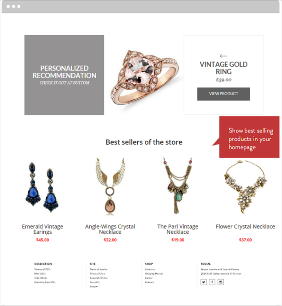
This is the ultimate e-Commerce strategy that your marketing plan should not miss. With this, you could make your sales soar threefold and your conversion rate increase by as high as 150%. So how exactly does product recommendation work? At this point, take note of big names in the e-Commerce industry– Lazada, Big Cartel, and Amazon. The products they featuring is unique to every individual visitor. All of these are tailored to every customer’s activity on their webpage. Depending on what your shop visitors have bought, added to wishlist, or simply viewed, a well chosen product recommendation increases their chances of checking on more interesting items they may eventually end up purchasing. These recommendation can either be — generic products that are typically browsed through by the site’s visitors, complementary products to maximize their use of an already chosen item, or alternative products with better deal than their primary choice.
The key to effective placement of these recommended products is by knowing the right location for you to place your widgets. That is where the Personalized Recommendation app will come in handy in making product recommendation strategy. And yes, satisfied subscribers say it works!
Conclusion
Just consider: a decade ago, digital upsells and social retails hardly made any noise in the industry. Now it’s the lifeblood of huge and successful businesses. This is the lifeblood of your business! As e-Commerce strategies constantly modify each year, take time to consider the current trend in the global online market. Tailor your site to generate an increase in your conversion rate. Implement these very strategies Amazon and other established e-Commerce companies employ.
Author Biography: Alice Ha – Co-founder and CMO @Beeketing. She has been 5 years in the e-Commerce industry, with various experience in online marketing, website optimization and UI/UX. Co-founded Beeketing in 2014, she has a hope to bring best marketing automation solutions to small and medium online business, to help them sell better and save more time.

