A great unboxing experience will boost your content marketing efforts, drive engagement, increase sales, as well as improve the way your customers feel about your product.
First, though, what is unboxing?
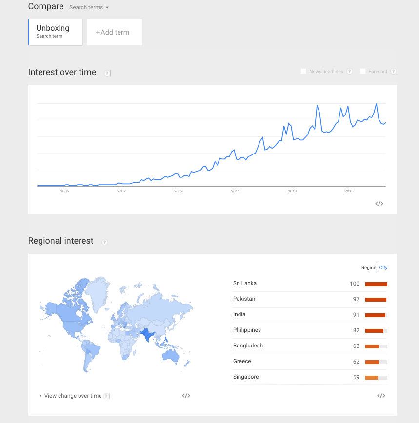
‘Unboxing’ is just what it sounds like: the action of taking something out of a box. But it’s also much more than that. If it wasn’t, there wouldn’t be 1.6 million videos on YouTube devoted to it, with popular channels drawing in as many as 2.4 billion views. It might be odd-sounding but it’s not niche, and it’s growing – by 57% a year, according to Google.
Unboxing videos are drawing big views. They’re a great opportunity for marketers to get engagement and attention for their brands. But how much of that engagement is just people talking? Unusually, it’s actually a minority. About 62% of people viewing unboxing videos have purchase intent and are actually scoping out products. And views spike along with big purchase periods – Christmas, Back to School, and summer holidays. So this is definitely something we all should want a piece of.
But when brands try to make them themselves, they tend to fall flat. It’s consumer unboxing videos and channels that draw millions of clicks. Brands fare best when they make spoof unboxing videos like Samsung’s. Viewers don’t want a brand to make videos. They want to make videos, or to see other consumers make videos. So what can brands do to get in on the unboxing phenomenon?
To answer that we need to know why people care about unboxing. It’s a social occasion that partially replaces shopping in bricks and mortar stores. When you can’t touch or feel the product unboxing videos provide transparent, human validation and a glimpse at the product in a way that’s unmediated by the brand. Unboxing videos are live-action, name-traceable customer reviews: marketing gold dust.
People also care about unboxing because it’s often the first time they touch anything you’ve created. If you’re an e-commerce store, your customers can look at your website and experience your contact campaigns – email, in-app, push, SMS. But the first time they hold your brand in their hands is when it falls through the mailbox. Unboxing videos are addressing this too: they’re saying, ‘this is what it’s like to be brandxyz.com’s customer.’ Does the time between receiving the package and using the product for the first time really make that much difference? Ask 2.4 billion Youtubers.
Building a truly awesome unboxing experience is user experience planning applied to shipping, packaging and presentation. What does that look like in action? Well, since you ask…
The 7 Best Unboxing Experiences
1. Dollar Shave Club
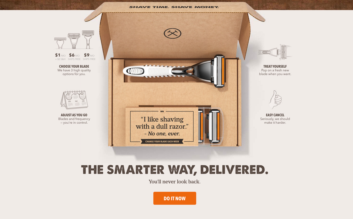
Dollar Shave Club set out to disrupt the multi-blade, high-priced world of men’s grooming with cheap, quality shaving gear delivered on subscription. Think the Warby Parker of shaving. Their boast? ‘Our blades are f***ing great!’ (Seriously – video NSFW.)
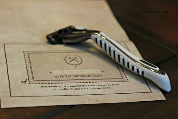
Inside the package, you’ll find the handle – for first-month subscribers – together with the blades in a plastic clip-in box. Their branding isn’t visible anywhere on the product itself.
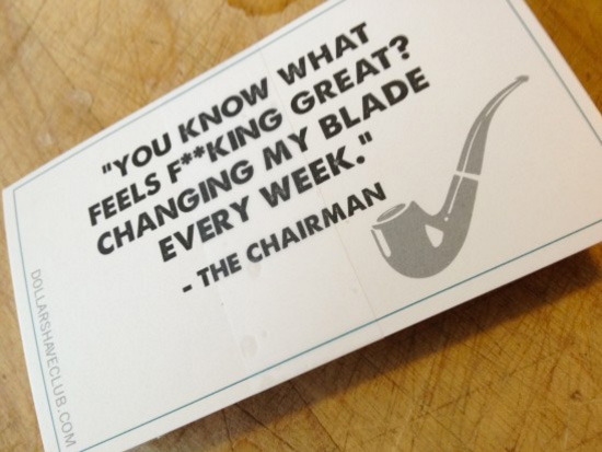
Here’s where Dollar Shave Club really shines. Slogans building on the iconic (seriously. Check out the views) video carry the brand identity across to the product and imply it in the experience of using it. Blades come backed with a card reading, ‘you know what feels f***ing great? Changing my blades every week. – The Chairman.’
Facebook UX and content strategist Jonathan Colman says, ‘this is exactly what I wanted to see from Dollar Shave Club. Printed microcopy that’s right on brand, makes me laugh, and that aligns solidly with the original video experience.’
A membership card underlines the brand’s value proposition – it’s about the product, but it’s about identity and a certain kind of canny prestige too.
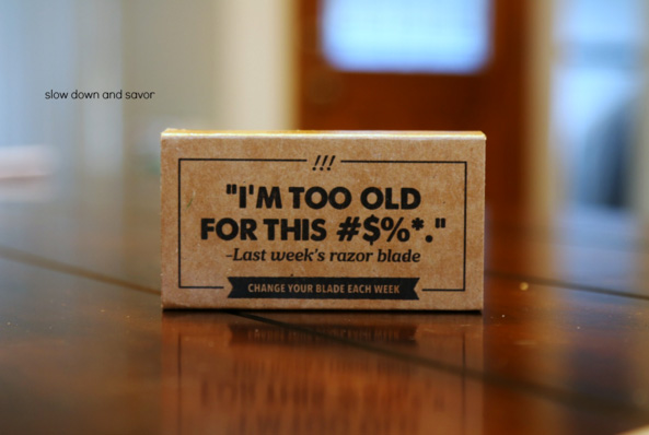
Old blades can be stored in a box marked, ‘I’m too old for this #$%*’ and there’s a spoof free-drink voucher that warns you not to ‘drink and shave.’ (It was good enough for Don Draper, but those were different times.)
What’s unusual compared to a bricks and mortar store is the products aren’t branded. Dollar Shave gets their razors from Dorco, which has a good rep, but you can buy those yourself direct for far less. Instead extras and packaging tie in to the utilitarian aesthetic of Dollar Shave Club. Many subscription services offer couture, hand-crafted products heavy with nostalgia. Dollar Shave Club wins out by placing value front and center and doing it with confidence and humor.
The unboxing experience isn’t structured: you get an envelope, and there’s no specific order for taking the contents out. While the process of unboxing isn’t super complex, it’s still managed to attract 10,800 Youtubers to film the process, and it shows how the secret of its success is that it’s so minimal.
Dollar Shave Club have a great unboxing experience even though they keep costs low and don’t give a bunch of extraneous packaging, handwritten notes and structured boxing.
2. Birchbox
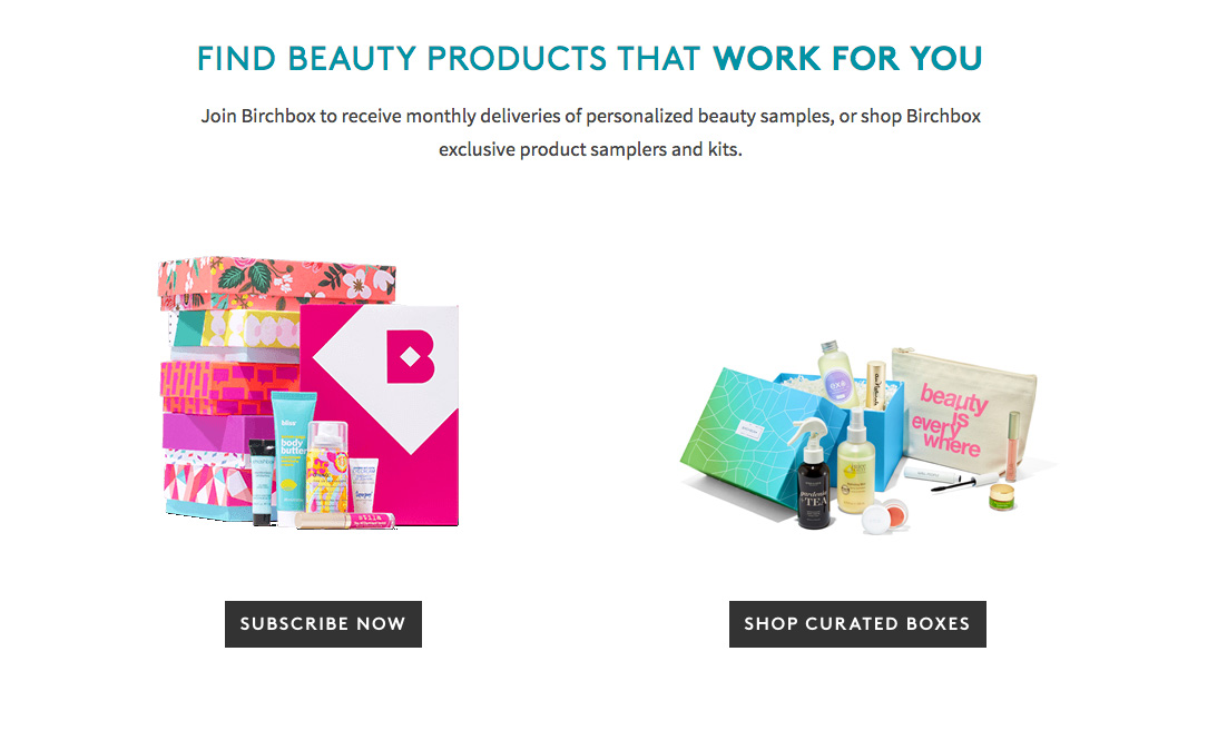
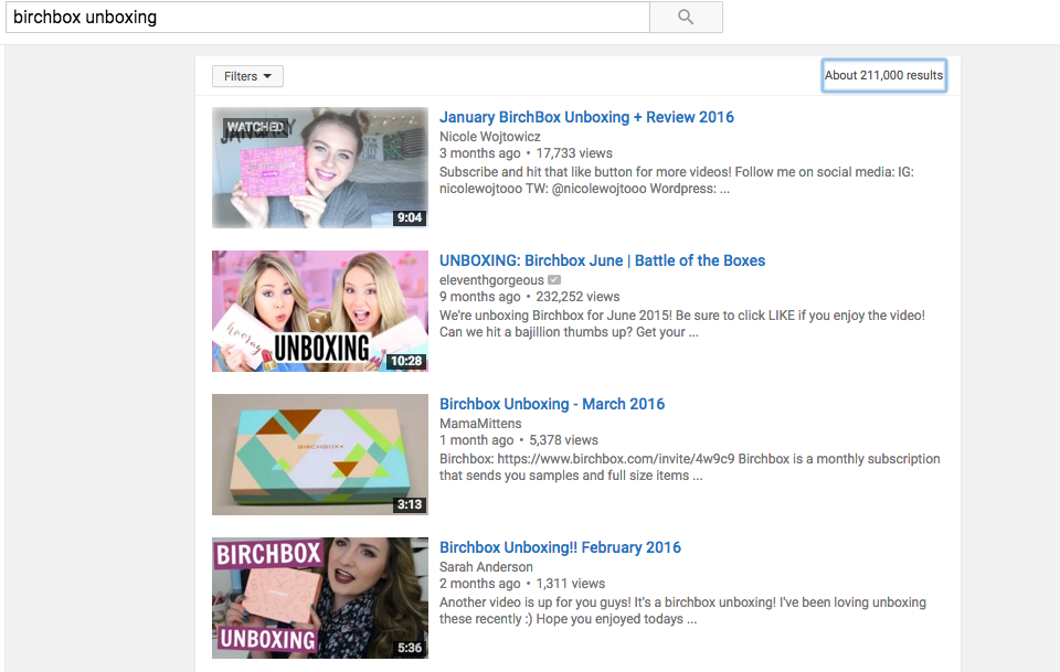
Birchbox has made itself a niche offering samples of cosmetics and beauty products on a subscription basis. As one of subscription e-commerce’s originators they’d be worth watching, but the fact is they did it all on the back of a killer unboxing experience – so much so that there are almost a quarter of a million YouTube unboxing videos dedicated to Birchbox alone.
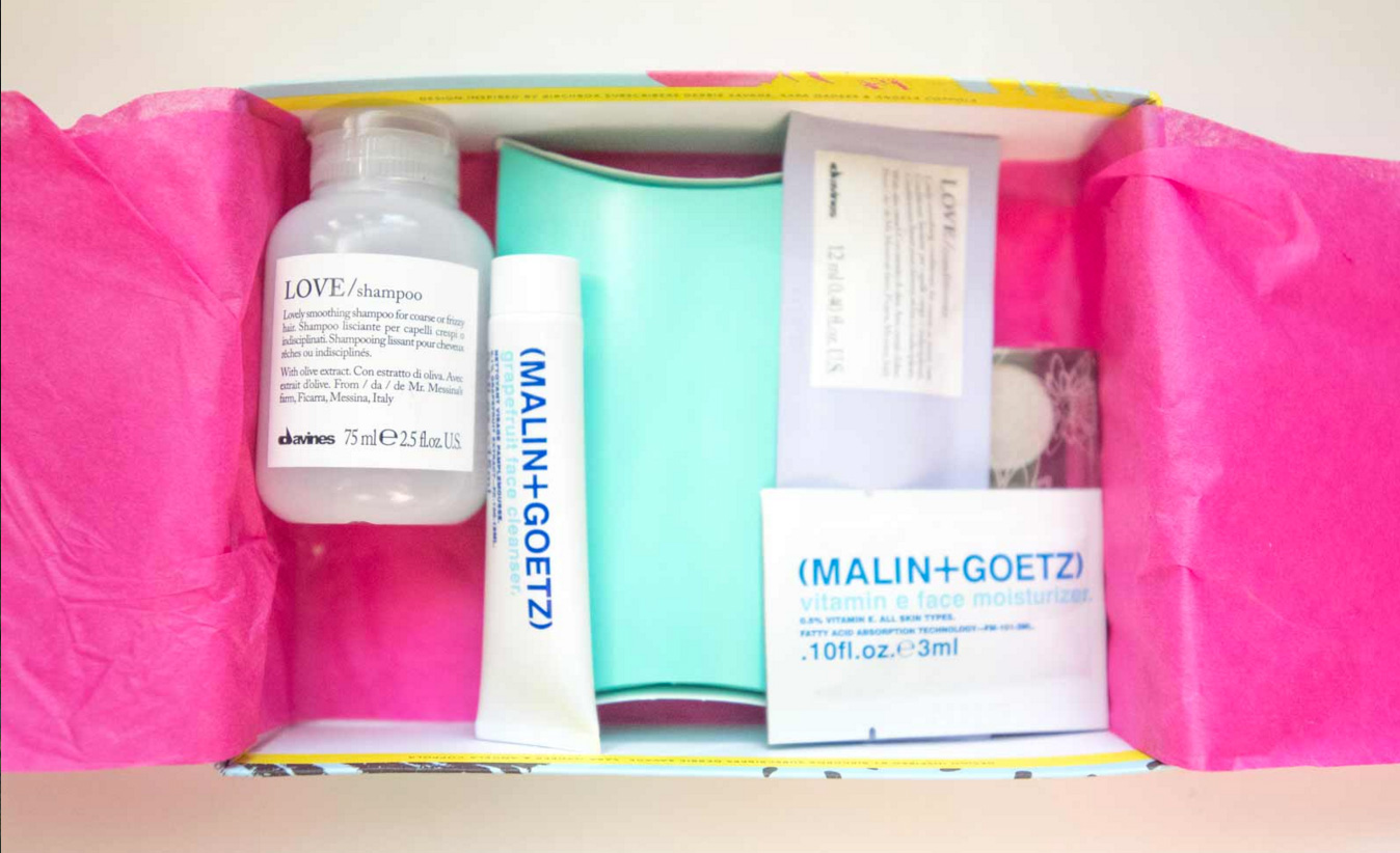
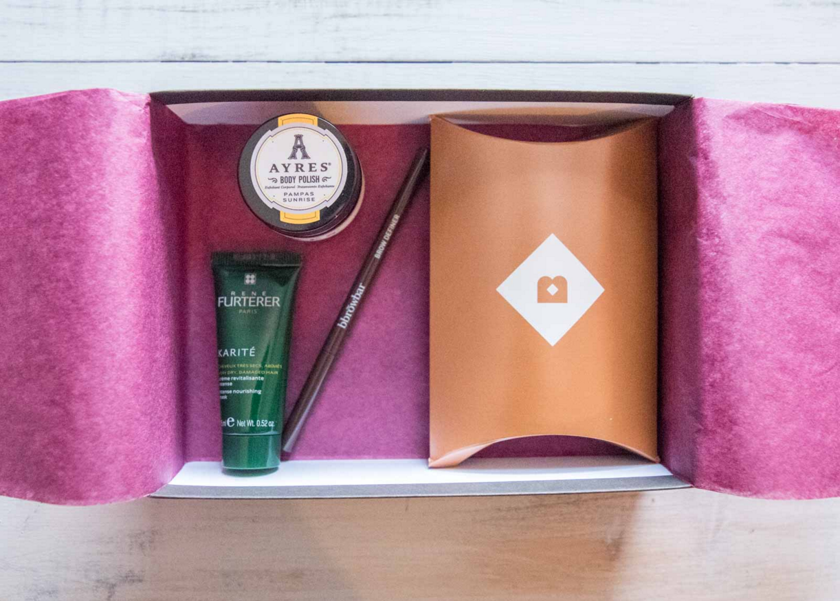
Birchbox packages differ every time, and so does the box decor. Inside, the layout is dependent on the contents, which also change monthly. The package is expressly designed to fit mailboxes so there’s no need to sign for it.
Birchbox sends subscribers different beauty products each month. Small samples of skincare and makeup products allow subscribers to experiment for less than a store would charge and the value of anticipation is another major draw: Birchbox, not its subscribers, decide on the content of each box.
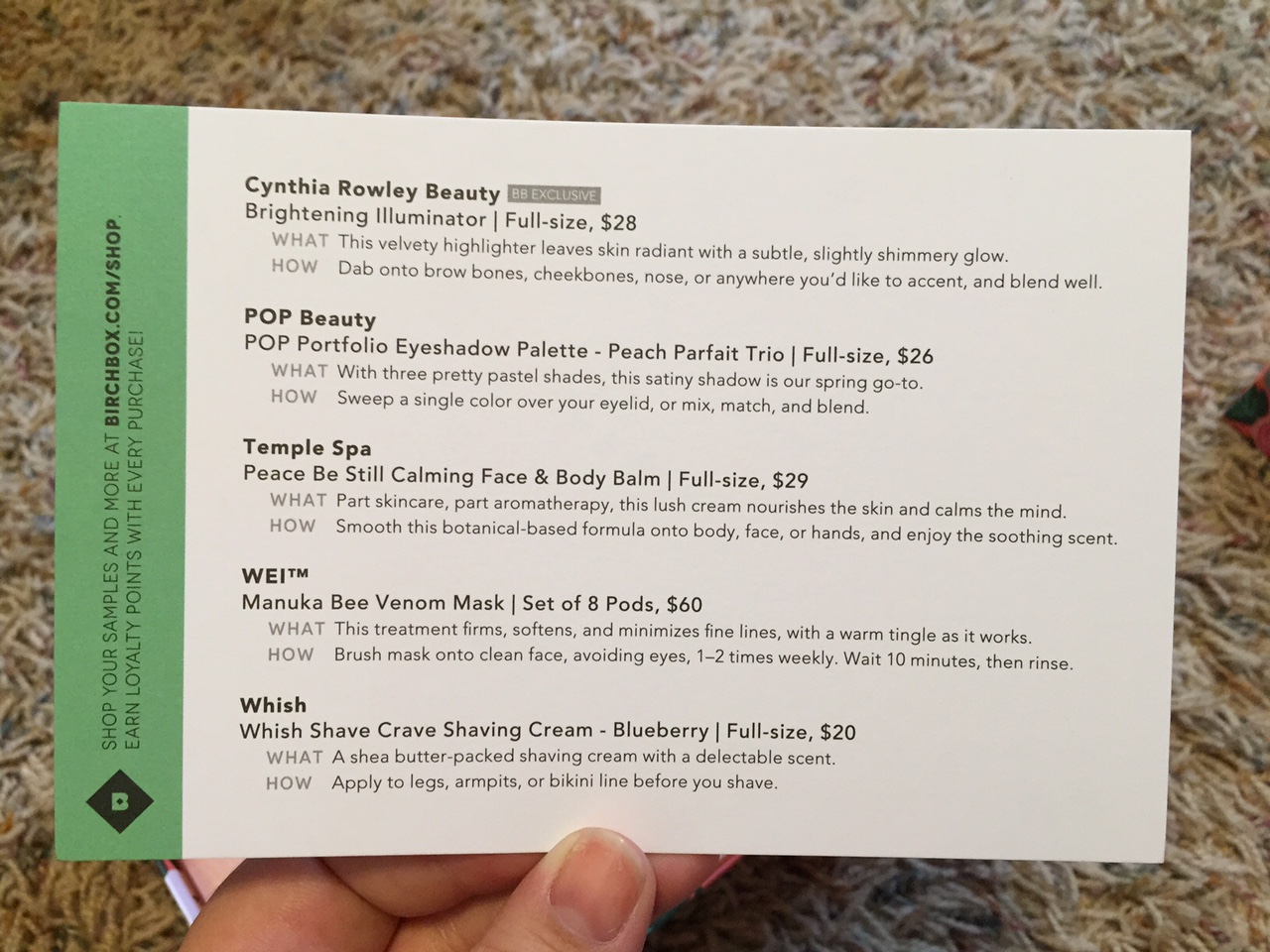
There’s a card inlay that tells subscribers what’s in that month’s box, and a note from Birchbox founders Katia Beauchamp and Hayley Barna.
There’s usually some internal wrapping paper, colored to go with the visual theme of the box. Sometimes boxes will include competitions or activities – January’s this year featured an inspiring slogan with the last word left blank emblazoned on the outside of the box.
Open up the package and there’s a sticker collection, with words like ‘strength’ and ‘creativity’ to allow subscribers to complete the slogan themselves – and encourage them to keep the box, which many subscribers collect.
Birchbox demonstrates how to brand an experience. One thing that differentiates the Birchbox unboxing experience from others is that immediately the products are out of the box, unboxers are testing them. The unboxing process in actually what Birchbox offers, in many ways, and the structure of a box, much like a box of chocolates, reflects this.
Birchbox has figured out a way to tap into a practical solution for an actual pain point – the majority of their female customers are younger women who still aren’t sure exactly what they like, or want to wear a lot of different styles. And 30% of Birchbox sales come from their e-commerce store where they sell full-size versions of ‘box offerings. Birchbox is a live-action beauty magazine, and the unboxing experience underpins its success.
3. Apple iPad Pro
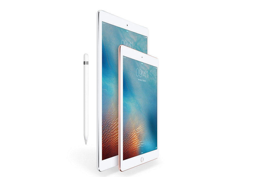
Apple incorporates great aesthetics into their products, and their philosophy that design is not ‘how it looks. Design is how it works,’ in Steve Jobs’ famous phrase, carries through into their packaging, store environments and unboxing. In fact, Apple has an ‘unboxing room’ where designers experiment with packaging, seeking the combination that creates the perfect emotional response when a customer rips into it to get at their new iPad. So it’s no surprise that their unboxing is good, and videos of it are incredibly popular: there are 2.35 million ‘unboxing iPhone 6’ videos on YouTube.
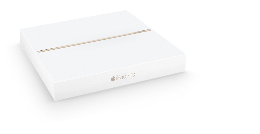
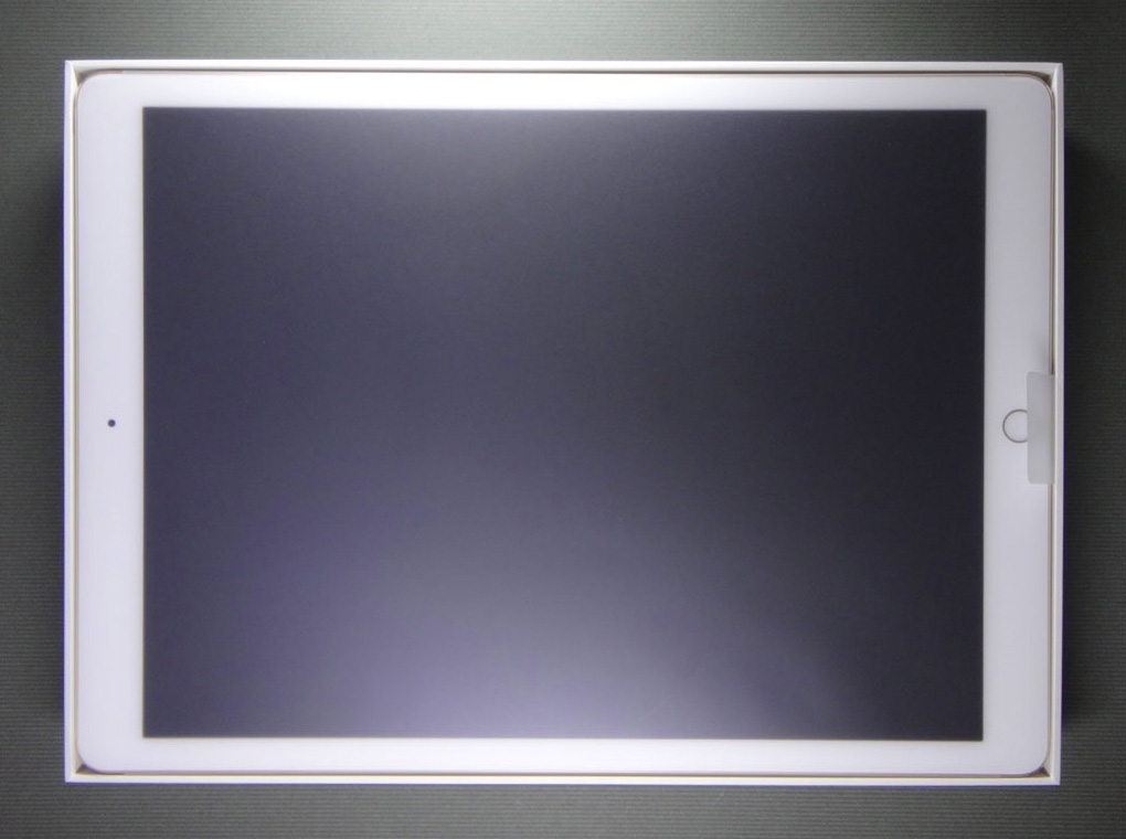
New iPads are delivered in brown boxes, with Apple’s own packaging inside. Apple’s packaging is an extension of their product design: smooth, minimal, white, with discreet branding. There’s an image of the iPad itself on the front of the box, emphasizing the slimness of the product.
Opening the iPad Pro’s box is a carefully-designed process, and it shows. After the plastic wrapping, it’s more or less effortless. The lid of the box slips off to reveal the iPad, filling the box edge to edge.
For many other tech or computer products, the first thing you see is more packaging, power leads and controllers, or instructions and warranties. Apple gives you what you paid for right up front, screen-up. The experience of using it begins before it’s even out of the box.
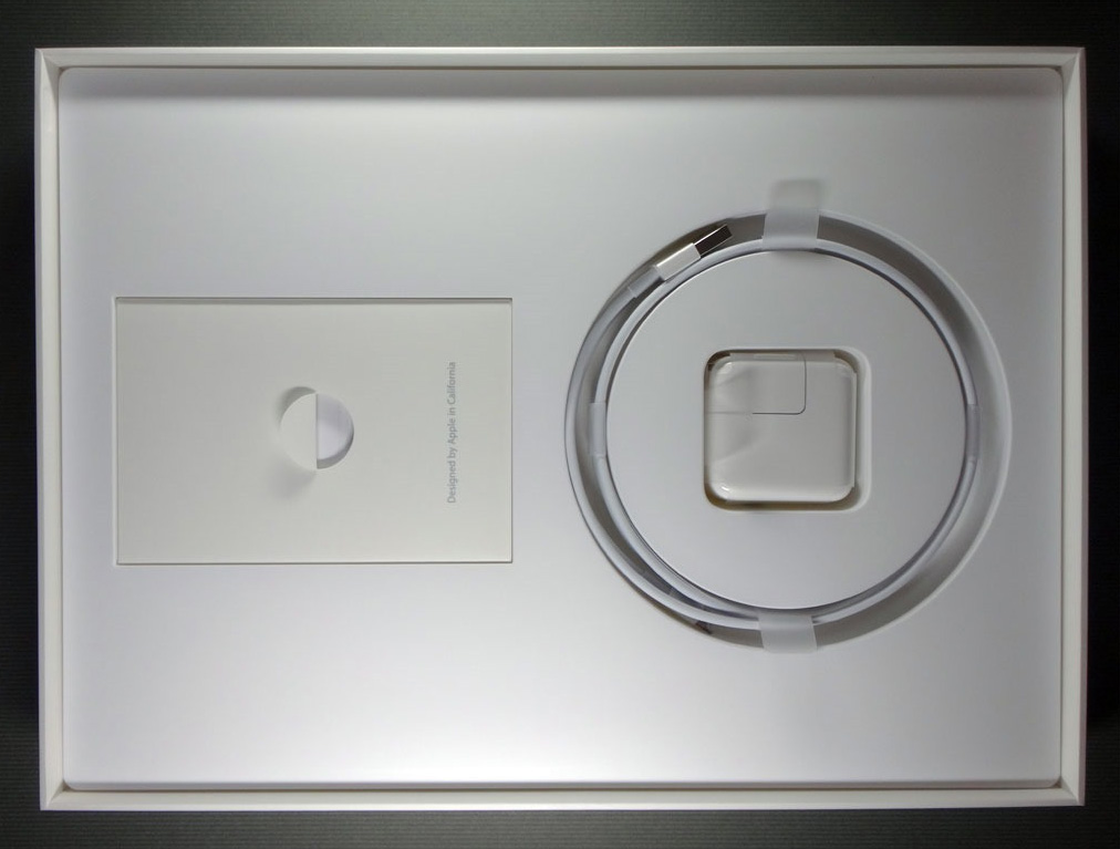
Once it is out, the power lead is found coiled neatly underneath it, along with a USB to jack lead and a card wallet that contains warranty and setup information. The interior of the box is optically white, like the contents.
While Apple’s unboxing process is quick and painless, it’s also structured. In a design-forward move that’s now being widely imitated, unboxing begins on the outside of the box, where a clean, minimal appearance carries the Apple brand to the purchaser before they open the box. Placing the actual product front and center is an effective way to spike anticipation and move customers through to first use.
4. Nest Learning Thermostat 3rd Generation
Nest makes learning thermostats. ‘The idea,’ say the company’s founders, ‘was to take the technology we had been creating – technology that powers things like your smartphone – and embed it inside important yet unloved products.’
That puts them at a disadvantage compared to purchases that run on ‘future promise’ that’s immediately rewarding. Opening a new package of makeup or a new iPad is immediately rewarding because the product is anticipated and the reward of using it is right now. Using Nest’s products isn’t immediately rewarding in the same way. So how does Nest build delight in their ‘important yet unloved product’?
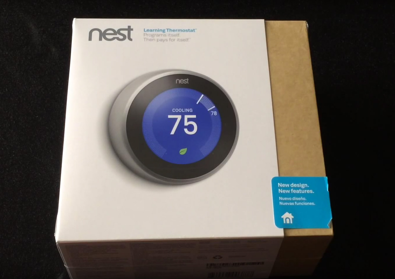
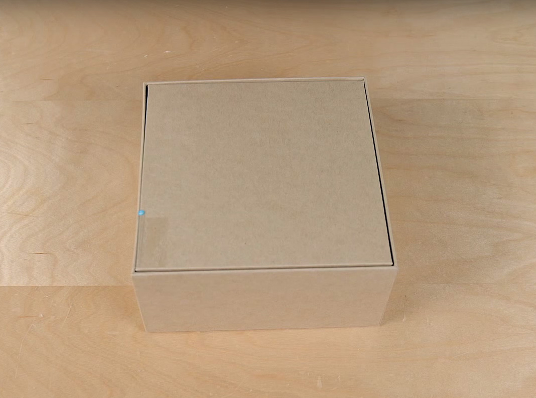
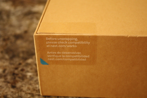
The outer packaging, a brown cardboard box in a white sleeve displaying the product, is sealed by a plastic tab bearing the notice: ‘Before unwrapping, please check compatibility at nest.com/works,’ and with an easy-peel corner highlighted in blue.
That’s your fist heads-up that you’re about to get a highly-structured, designed unboxing experience where pain points from ‘how do I open the box?’ To future concerns about installation are allayed at every step, allowing customers to focus on that sense of delight.
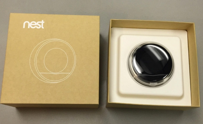
Once you’re inside the Nest box, you’re face to face with the product immediately. Is this the spreading influence of Apple’s design aesthetic, or just a good unboxing UX choice? Hard to say, but the effect is there: it looks clean, simple and ready.
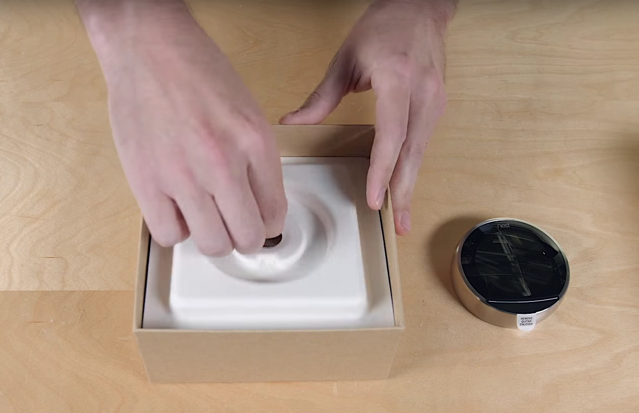
You’re not confronted with leads, wires and complex tools that cause your heart to sink. Remove the unit itself and the plastic sectioning underneath it can be removed with a fingertip.
Under the top layer of packaging, there’s a neat envelope containing visual instructions for mounting the unit.
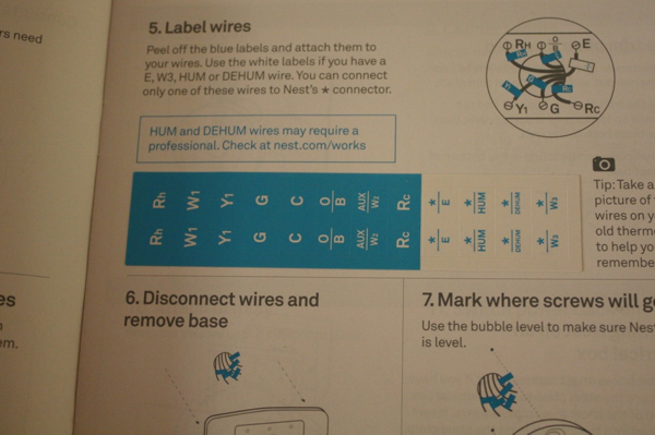
Then the remainder of the unit – back, wall mountings, screws. The manual includes adhesive plastic tags for the wires so it’s easy to track them as you mount the unit.
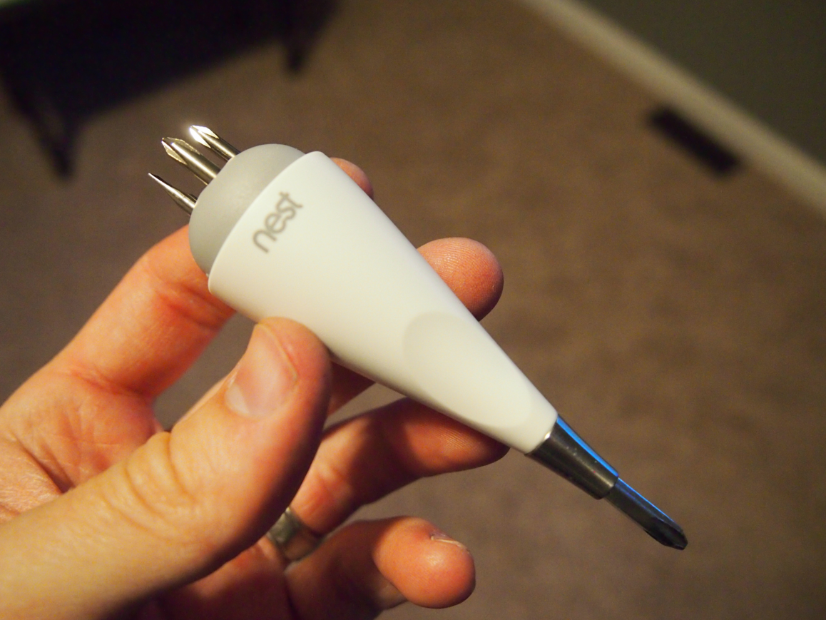
A screwdriver is provided too, and in a neat touch branding extends even here. The screwdriver is white like the packaging, with a bulbous, teardrop handle that lends a smooth, tech-oriented feel even to an everyday tool. (It’s got extra heads inside too!)
The Nest unboxing experience is a masterclass in unboxing as UX. It reassures customers about their purchase, eases anxieties about setup and installation, and provides immediate pleasure as they remove the product from the packaging. And it does it all within a carefully designed, highly structured unboxing experience that feels like a physical expression of user journey mapping gone really, really right.
5. Thrive Market
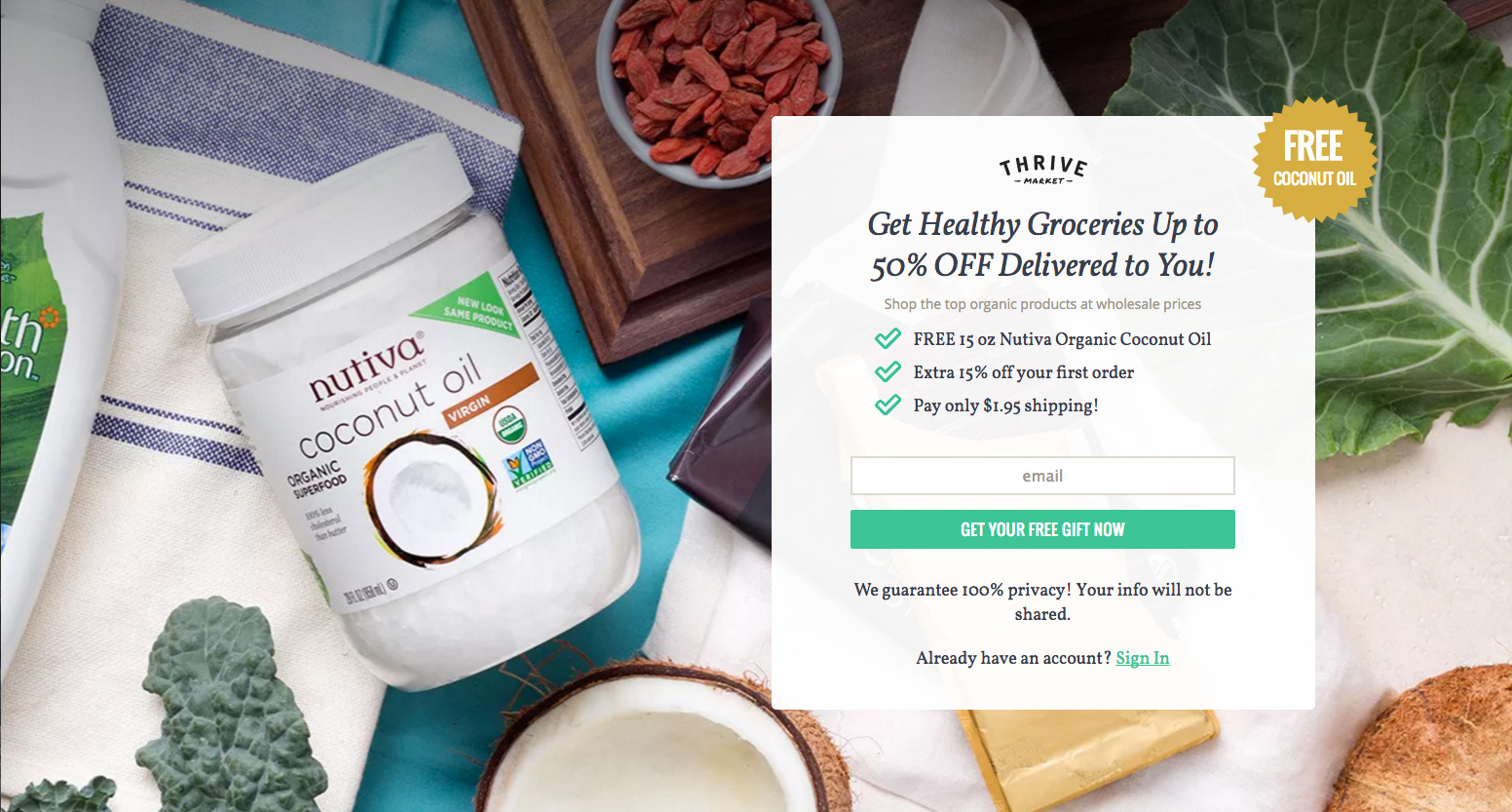
Thrive Market differentiates from other startups-in-boxes because it’s a grocery service. Rather than Graze’s upmarket snacks, Thrive market seeks to bring farmer’s markets to your door. Perhaps best described by YouTube cooking show host Carolyn Fleminster as ‘wholefoods meets Costco,’ it’s a subscription-plus-purchase model that allows wide choice and keeps costs low.
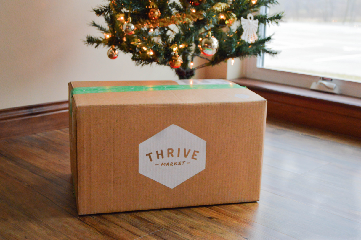
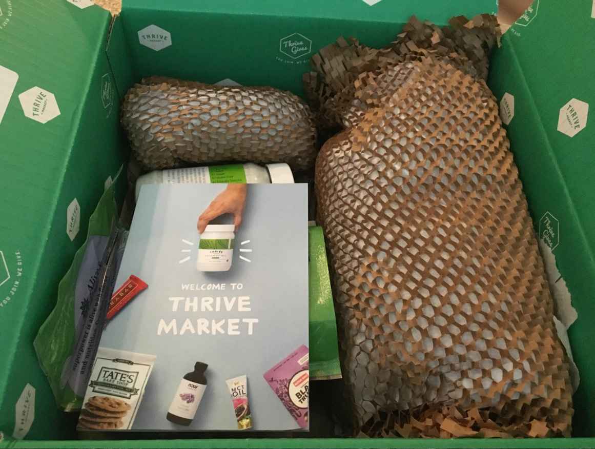
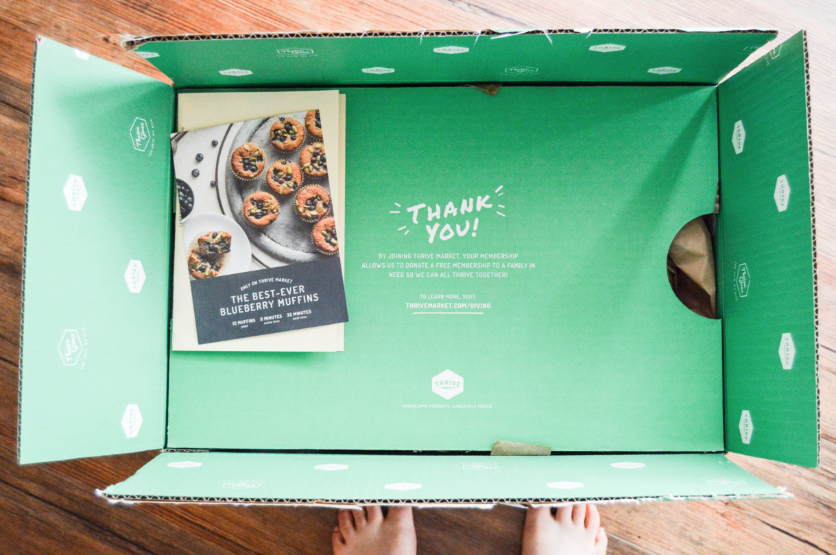
Thrive’s model hopes to sell to health-conscious consumers looking for food, supplements and grooming products. So the box is pretty big. Branded brown cardboard on the outside, the interior shows a branded, wallpaper-like design. The box is divided lengthways to prevent items getting damaged. Particularly breakable items like glass jars are wrapped in biodegradable packaging, an expression of brand ethos.
Similarly, Thrive Market does its own packing, rather than using a third party. A privately-owned return address, rather than a big warehouse used by multiple companies, implies more accountability and care.
Thrive has killer website and box branding. But they slip up on the interior a little, offering a generic shipping invoice that looks like a computer spit-out. Right over that, though, comes a thank-you note on the same green-and-white color scheme as the box.
Thrive has a great unboxing experience that totally centers on the box itself. The moment of opening the box is their focus – their customers aren’t going to sample their products immediately. So they have to emphasize the pleasure of getting the box and deal with shipping on a heavy, mixed food-quality box too. Against all that, they’ve managed to create an effective unboxing experience – in just the 17 months since they set up in November 2014.
6. LootCrate
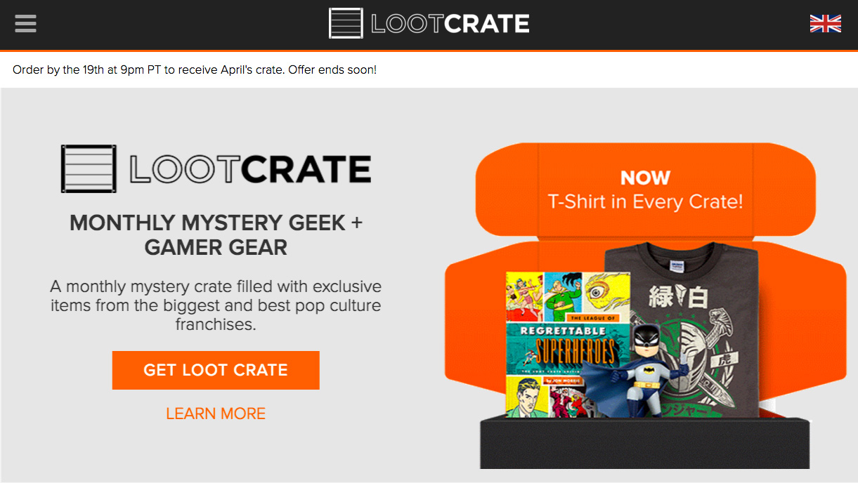
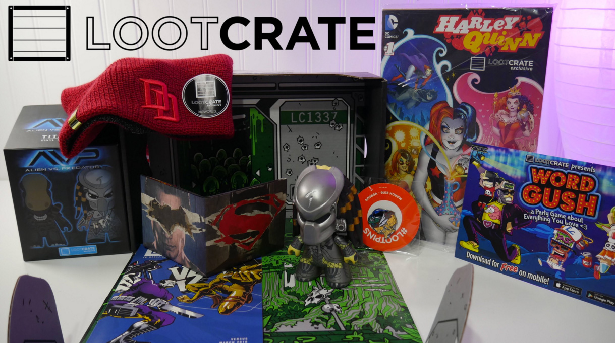
LootCrate combines the two favorite categories of unboxing: tech and subscription-in-a-box. They’ll send you $10 worth of geeky fun on a monthly basis.
That doesn’t necessarily mean there’s a great unboxing experience, but there’s certainly the opportunity to make one that will definitely be shared by a tech-savvy audience that will knowledgeably critique whatever the company sends them.
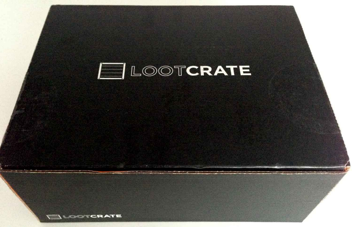
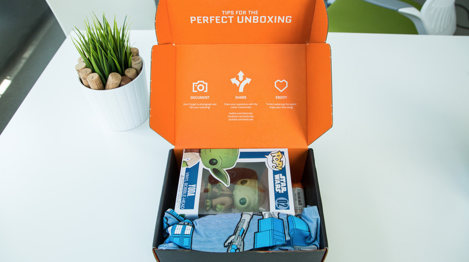
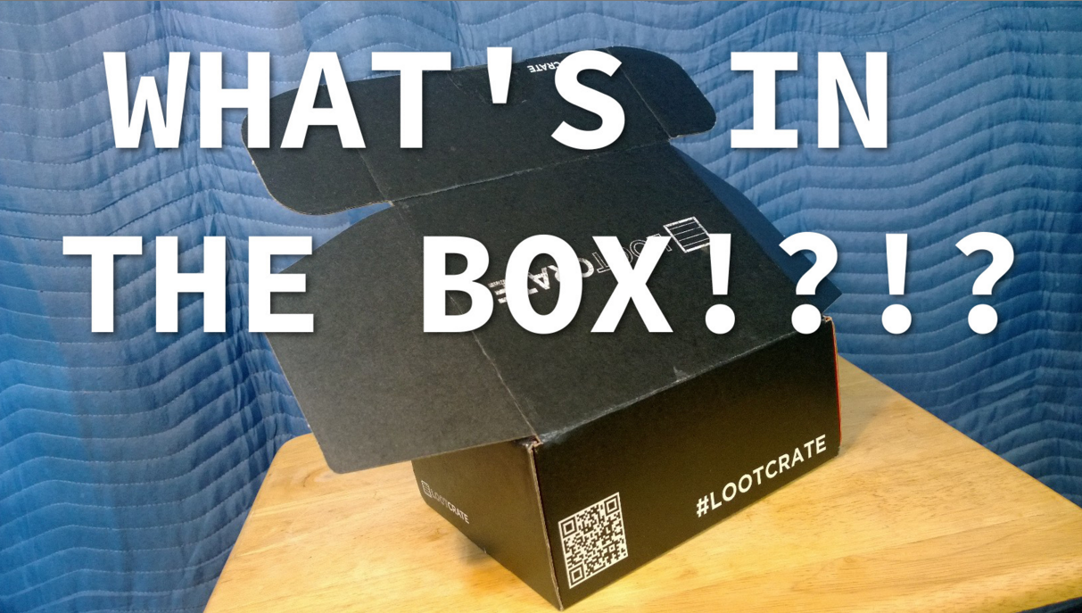
LootCrate typically uses a shoebox format for its outer packaging, though its themed offerings mean that the shape and size of each month’s box can be different. Inside you’ll find brand decor – ads for the contents, or decoration that’s culturally relevant to the self-consciously geeky target audience.
Or, you know, some help making and sharing your own unboxing video.
The products are packed differently each time, though there’s a T-shirt in each box now, which must help to pad the interior of the box as well as spreading the reputation of the service into casual conversations amongst subscribers and their friends. Many items require unboxings of their own – March’s theme, ‘Versus,’ involved boxed Alien and Predator action figures.
Like all the best unboxing experiences, LootCrate has figured out a way to make theirs much, much more than taking stuff out of a box. Rather than focus on adding value to the box or making the boxing address pain points, they’ve taken a riskier but more rewarding route. They set a theme every month and tease that theme all month without revealing the box’s contents.
Thus, when the crate arrives, subscribers have a month’s worth of anticipation. Will their favorite fandoms be represented?
7. Samsung Galaxy S7
Samsung is seriously dedicated to digital marketing – three of YouTube’s top ten viral videos were theirs as of March 2016, so it’s hard to believe that they haven’t planned their unboxing with the camera in mind. Their flagship S7 provides a classy unboxing experience with brand identity strongly forwarded.
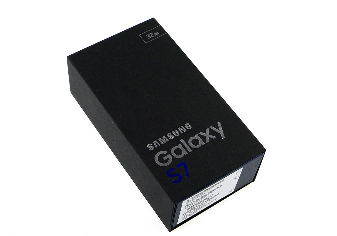
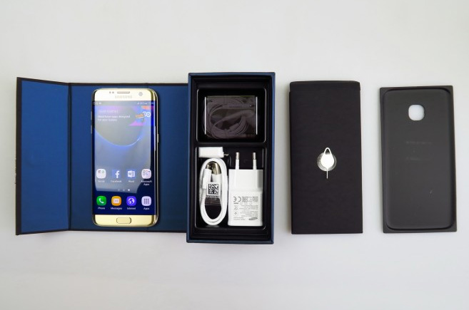
The S7 comes in a black matt box with silver inlaid sans serif labeling. If Stanley Kubrick made aftershave, it would like this. It’s a sleeved box, which you open by just pulling the two sides, a popular choice because it’s secure but easy to open.
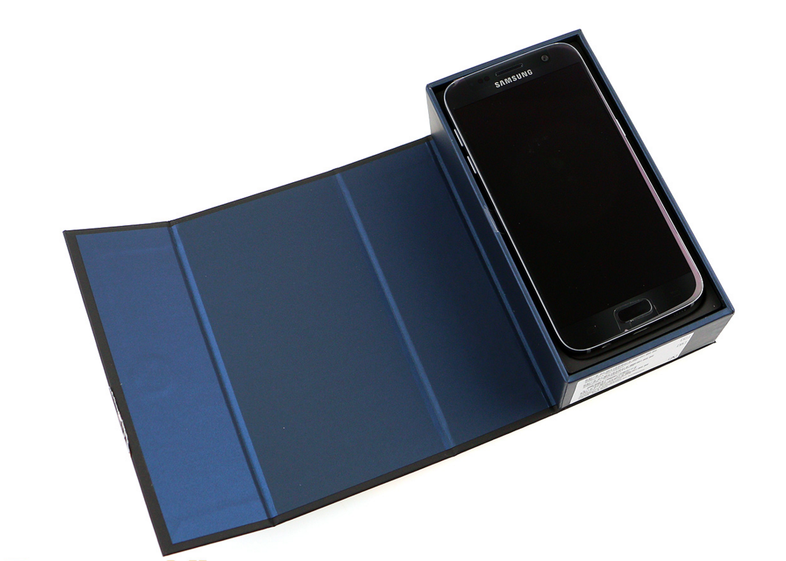
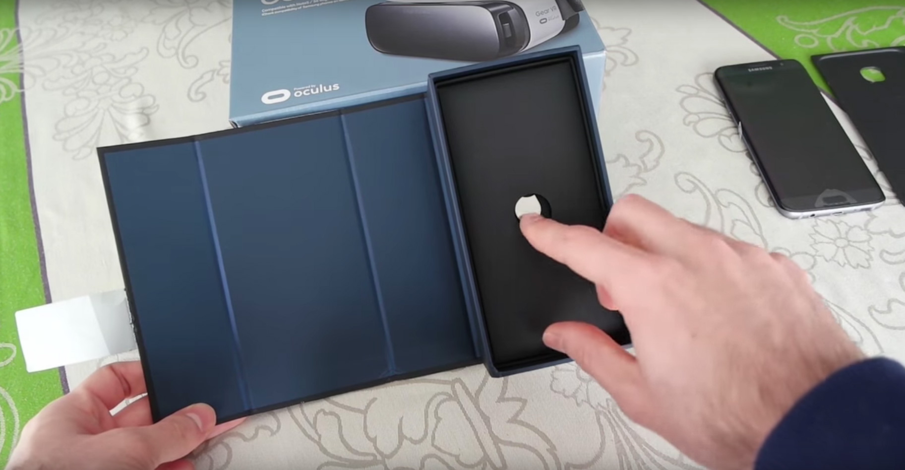
Inside is a hinged presentation case, branded on the front with a small, discreet logo, and lined in midnight blue. It’s the kind of thing you’d expect to find a premium watch packaged in. The phone itself nestles face-up in the box and can be removed with a plastic tab so there’s no struggle to get it out. Underneath, there’s a matt black package housing the SIM tool and paperwork, which has a finger hole in the middle for easy removal.
Keep going and the peripherals – charger, USB/mini USB cable, earbuds – are stored in shaped compartments in the bottom of the box. One nice addition is the mini USB/USB adapter that lets you plug two Samsung devices into each other for file sharing via the charge port.
Samsung have a stiff uphill climb – their major competitor is the iPhone, one of the most anticipated, most YouTubed unboxings around. So they have to somehow strike a chord, and imitation won’t do it. Where Apple went for minimal simplicity that almost looks like software front-end design, Samsung has chosen premium packaging styling but a similarly structured unboxing experience. Tokens of extra consideration like the earbuds and USB adapter encourage a high valuation of the product and assuage anticipated pain points. And the user journey planning of the unboxing experience can’t be quibbled with: there’s never a moment when the easiest, most intuitive thing to do isn’t the right thing.
Oh, and…
Boeing Dreamliner
It’s not strictly something the rest of us can really learn from, unless the lesson is ‘anyone can create a great unboxing experience.’ Or unless you’re selling jets. But it does deserve an honorable mention.
Check it out!
Unboxing Best Practice
Building a killer unboxing experience is about extending user journey planning to link your product to your marketing. Which of those is unboxing? It’s both. That’s crucial to leveraging it: customers regard user experience as the most important service any business provides. They’ll base purchase decisions on it. They’ll pay more for it. And they’ll tell each other about it. So if you want more referrals, better customer retention and access to a content marketing channel you just can’t get any other way, you need a great unboxing experience.
How Should You Do It?
Start With the Box
Customize your packaging. Any branding, any sign that you’ve taken additional care and not just had your product shipped by the cheapest carrier you can find, pays of in customers’ eyes.
The Layout is Critical
Most of the brands that do unboxing best use structured boxing to guide the customer through the process. Look at Nest or Apple: It’s Product > Instructions > Peripherals, assuaging pain points and delivering delight at every step. But even the simple divider in Thrive Market’s boxes adds value. Layout is presentation. You wouldn’t just stuff everything into your website any old how – the same applies to your packaging.
Acknowledge
Thank your customers! A handwritten thank you note can work wonders, but Birchbox and Thrive Market get by with printed ones. Taking the opportunity to appreciate your customers and make a personal connection makes them feel like you care.
Ease of Use
Your unboxing is both marketing and product. The moment they sign for it, or it falls on the mat? That’s when your product’s user experience begins. And it’s many e-commerce customers’ first physical contact with your brand. Make it count: make it easy! Learn from Apple, Nest and Samsung: Every time there’s a decision to make in the unboxing process, the right choice is the easiest choice. Never leave customers thinking, ‘how do I…’ And where possible, assuage worries about implementation too. Nest excels at this: by the time the box is empty, the least handyman-like person knows what to do, how to do it, and that they have all the tools they need.
Extras
Peripherals – like Samsung’s USB-mini USB adapter – add to the experience like chocolates on a hotel pillow. Notes, presents, samples, entries in prize draws, all add an extra layer of pleasure to the unboxing process.
Marketing
It’s easiest to market to customers you already have. Take the opportunity to reach out with other products or services they might be interested in. Build offers into the unboxing experience. And don’t forget that you get the referrals you ask for; if you’re proud of your unboxing, copy LootCrate and ask customers to share it!
About The Author:
Richard Bayston is a freelance blogger and copywriter covering tech, digital marketing and content strategy for SMBs. I’ve also been known to write on health and fitness. Find out more: Richard@RBCopywriting.com or @RBCopywriting. The rest of my time is spent arguing amicably with my wife and Googling the answers.
*Featured Image Source

