Shopping cart abandonment is one of e-commerce’s biggest revenue leaks. It dwarfs even bounce rate: Bounce averages 55% across industries; cart abandonment is around 68%, depending on survey and industry area. That’s more than two-thirds of potential revenue pouring out the funnel.
How can we arrest at least some of this flow?
In order to understand how to fix it, we have to understand how and why it happens.
Cart abandonment is actually a pretty vague term that suits us more than it suits the customer. We have a shopping cart; they have a desire for a new pair of pants, a more powerful flashlight or the right size spanner to fix their car already.
Their decisions don’t have much to do with the structure of the standard e-commerce shopping experience.
Think that might be the problem? Me too. We’ll get there. But first, where in the cart-to-purchase area of a website does abandonment occur?
According to InternetRetailer.com:
- 37.4% of companies surveyed said carts were being abandoned on login to checkout
- 46.1% said they saw cart abandonment at the payment stage
- 35.7% said they saw carts abandoned when users saw shipping costs
- 20.9% cited billing address requests as the abandonment trigger; 20% said shipping address requests were triggering cart abandonment.
- 18.3% cited ‘other reasons.’
What do customers say?
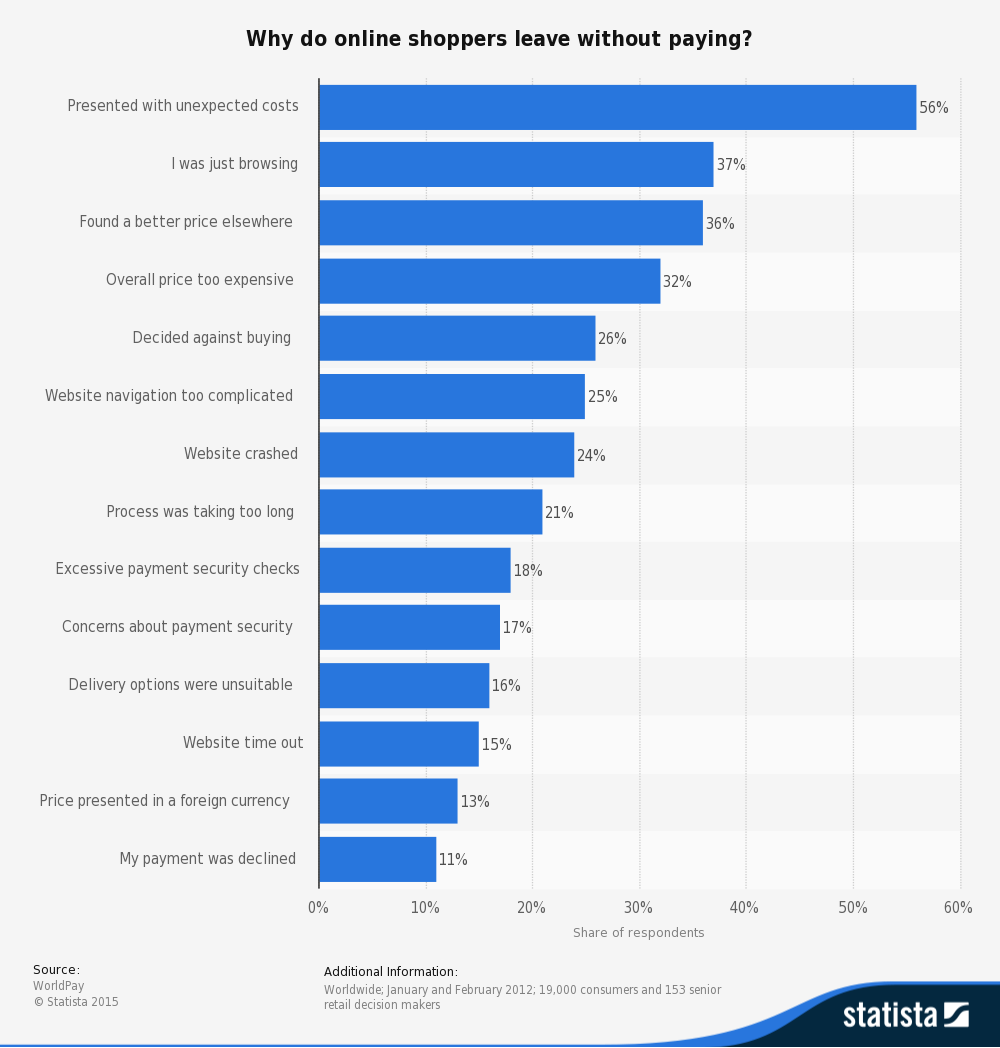
It looks like customers place a clearer emphasis on costs, basic structure, and technical function. But there’s also a big section who didn’t plan to buy that day – way bigger than IR’s 18.3% ‘other reasons.’
What’s going on there?
Interpreting Purchase Intent
37% of customers said they were ‘just browsing,’ and 26% said they just ‘decided against buying.’ Maybe something wrong with your website caused that decision. But a lot of the time, what e-tailers see as cart abandonment is really customers using the shopping cart as a ‘maybe’ tool, collecting items they might want to buy or dry-running the checkout process to figure out what the full costs will be. Three quarters of them say they plan to return to the site and complete the purchase at a later date.
While it might not be possible to prevent these customers from abandoning, it is possible to chase them up afterward with retargeting emails and social campaigns.
Retargeting emails can be effective if they simply remind customers that they have begun a purchase and haven’t completed it. These emails are opened nearly three times more often than standard marketing emails and convert 6X better. They’re so effective that up to 66% of cart conversions come from email.
Drip campaigns can also be effective, but by far the most effective single inducement is offers of free shipping. Which brings us to…
Shipping Costs
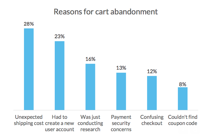
Shipping costs are a major – perhaps the major – cause of non-returning cart abandonment. In one survey 28% of cart abandonments were attributed to having to pay shipping costs.
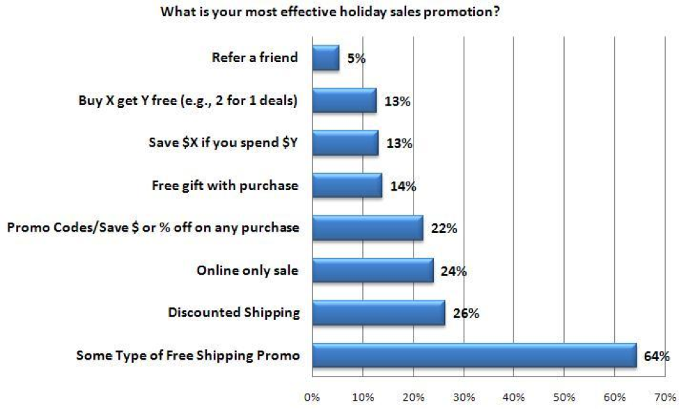
By contrast free shipping is most e-commerce store’s single most effective offer.
The psychology of free shipping is powerful.
Everyone’s heard of loss aversion – the idea that we hate to lose things. Once we think of something as ours, we tend to cling to it. Free shipping taps into this because people don’t see free shipping as ‘not costing anything’ – they see it as a positive gain.
They also see it as a right, and some are actively looking for free shipping, as a dealbreaker, right from the get go: 88% said they’d be more likely to buy from a store that offered free shipping. 58% will add something to their cart to qualify for free shipping.
Other Costs
Sudden increases in costs during the purchase funnel interrupt the dialogue a consumer is having with themselves. They’re OK with the $19.99 for the flashlight. Add on sales tax, shipping and a bunch of other stuff and they’ll panic and bail. You’ll also make your brand seem less trustworthy if you drop additional costs on people during the checkout process. They’ll feel apprehensive about clicking ‘next’ or ‘continue,’ wondering what charges will be added next.
The lesson here is simple: keep all costs as upfront as possible, revealing them as early in the purchase process as possible.
And offer free shipping.
People will literally pay for it, buying more or paying a higher basic purchase price to access free shipping.
If you can’t offer free shipping, try branding better shipping as a benefit worth paying for.
Pricing
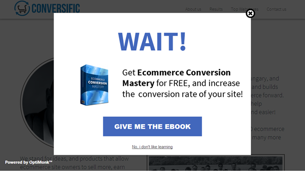
If you’re losing users because they found the same product at a better price elsewhere, you can consider offering exit-intent popups displaying reduced prices or offering discounted cross-sells and upsells.
This has been proven an effective tactic in reducing abandonment and increasing conversions, offering the chance to recover between 10% and 15% of abandoning customers right there on your website.
But you should also consider not competing on price. If your user is leaving because they found the same pair of pants for $17.99, not $19.99, maybe they were never going to be a great customer for you anyway. Competing on price is a hard situation to be in with any business. Do it online and your competition is Amazon, who can afford to sell huge swathes of electronic gadgets at below cost simply to acquire customer data for marketing purposes. Go up against them for who can take the dollar amount lowest and you’ll lose every time. Build a solid brand and you can win. So it might be worth just letting overly price-conscious users go.
Navigation
Website navigation is a trap for cart abandonment. Website processes that divert users into cul-de-sacs, where they’re reading your T&Cs in a pop-up before they get sent back to the checkout page? You’re losing customers who just don’t want to have to cope with that level of complexity.
Long checkout processes are a bane – but having complex checkout pages is a problem too, because your customers will struggle to use them on mobile.
Fixing this starts by simplifying your checkout process to make it linear and clear. Only ask for information that you absolutely need, and consider implementing social signup to make creating an account simpler. Permit buying from a guest account: ASOS halved cart abandonment by making guest account buying the default.
Simplify each page of your checkout to make it as mobile-friendly and easy to use as possible and consider a responsive design if you’re not there already.
Security
Security is a tricky one, online as in life. Everyone wants to fly safe, but no-one wants a longer line at the airport. 17% of customers have bailed on a cart over concerns about security; 18% have left because there were too many security checks.
How to get around it?
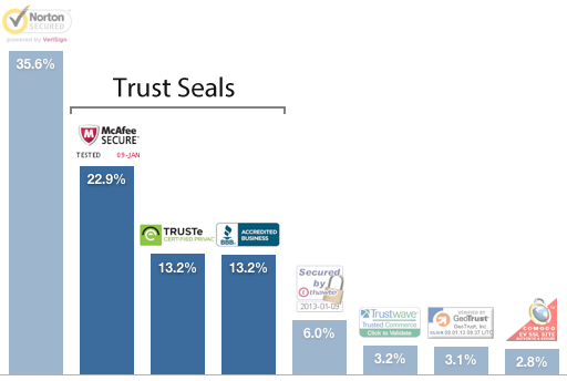
First, prominently display signs showing that your site is secure. Norton and MacAfee are the most well-recognized security badges.
Then keep checkout security questions to a minimum.
Technical Issues
Website technical issues caused abandonment for 39% of businesses surveyed by IR. Crashes and timeouts were having a serious effect on conversions. Throw in website load times
and we have a perfect storm of lousy technical solutions holding back effective e-commerce.
If website load times are too high that contributes to bounce rate. But it’s page load time that counts. If you have pages loaded down with trackers and complex graphics slowing your checkout process, that’s your bottleneck right there – and that’s where you’re losing customers.
Try navigating through your own checkout on a laptop with a video playing in the background. That way you simulate the browsing experience of someone using their computer for two things at once. Time page open times. Dollars to donuts, your checkout page takes longest to load. We have data on the effects of slow checkout page load times, from StrangeLoop in 2011 who found it could cause a 40% drop in conversions.
How do you fix it?
Lighten the load. Remove anything that doesn’t need to be there. Then make sure your servers can handle the volume of traffic you’re asking them to carry. Check your images, too: if they’re uncompressed, they’ll slow loading radically. (If you don’t compress your images you’re in good company: 45% of the top 100 e-commerce sites don’t compress theirs either. That doesn’t mean it’s a good idea.)
Cacheing
Cacheing on devices varies wildly. iPhone 5Ss won’t cache anything over 10Mb, for instance, so if you’re relying on your users’ hardware to carry the excess from your bloated checkout pages, good luck.
Cacheing in CDNs is another matter. CDNs – Content Delivery Networks – are nets of secondary servers that provide your users with faster service. If your checkout pages are still slow and you’ve fixed all the obvious technical issues, a CDN might be your savior.
Conclusion
You can fix cart abandonment and drive up conversions amongst the users you already have if you’re prepared to grasp the nettle and get into design and structure, looking at the whole way your website is put together from the point of view of your user. Do that and abandonment will plummet. Ally it with tactics like pop-ups and email remarketing for best results, but don’t rely on surface techniques alone or underlying problems will get worse and undermine your efforts. When you do see abandonment rates fall, though, you’ll see revenue rise and you’ll know it was worth it.
About The Author:
Richard Bayston is a freelance blogger and copywriter covering tech, digital marketing and content strategy for SMBs. I’ve also been known to write on health and fitness. Find out more: Richard@RBCopywriting.com or @RBCopywriting. The rest of my time is spent arguing amicably with my wife and Googling the answers.
*Featured Image Source

