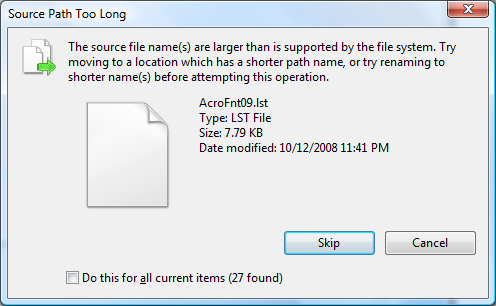
What do you do when you see a dialog box with a long text of instructions? We have all experienced this before. And usually, the long text is followed with two buttons – “Ok”, “Cancel”
You have very likely encountered a UI like the one above.
The plain fact is users will not read anything you put on the screen.
via John Gruber
The original article has a good case study on how writing detailed instructions on the UI is mostly pointless.
We come across this issue during the Ordoro UI design process every day. We try our best to stay away from lengthy copy on the interface. The user shouldn’t have to read instructions to click a button. He should just know it intuitively. Though this sounds like an easy thing to achieve, once you start practicing it consciously, you will find that it needs a lot of serious thinking to get it right.
In fact, 80% of our design discussions are around, where the button should be placed, and what copy the button should have. We start off with whiteboard drawings, and once we think we got the design almost right, then we build that into code. But then, as we start testing, we often realize that the design was not quite right, and we iterate. While perfecting UI design involves a lot of work, we also think it is a lot of fun.
If you are interested in interface copywriting, this article from 37signals is a must read. Another good read is Alan Cooper’s classic book. About Face: The Essentials of User Interface Design

