Less is more. 7X more.
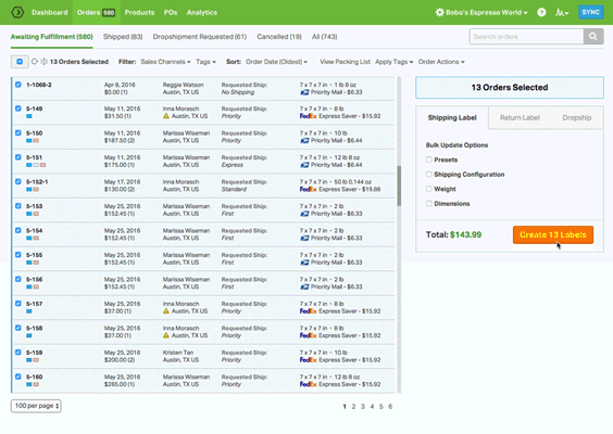
When we launched Ordoro 3, we vowed to accelerate and optimize your workflow. Now, close to year later, we’re delivering once again on that promise with a streamlined Orders page!
We’ve made more room for efficiency on the page by reducing the amount of unessential info shown on every order. Thanks to the improvements, up to 7X more orders are able to appear on screen at one time, giving you the power to crank out even more orders in a couple of clicks.
 And to dig into the details of any specific order, like ship-from info or the sales channel it was made on, all you need to do is click it!
Looking to get your hands on our handy new layout, as well as any of the other features of Ordoro 3, like Automation Rules and Shipping Presets? Set up an account in no time and blaze through your shipping workflow in record time.


