Checkout experience makes or breaks e-commerce success because it speaks directly to all your most important metrics: customer acquisition cost (CAC) and lifetime value (LTV).
The average cart abandonment rate across e-commerce is 68%. For every user who moves from putting an item into the cart to actually buying it, two don’t. And unlike other funnel leaks higher up the funnel, this is people who’ve already invested significant time and attention into your store and your brand.
That’s mutual: they’ve often received complex email and social outreach to move them through the funnel to where they are right now. Which is – leaving. Cart abandonment at 68% is significantly higher than bounce rate at 35% – and when customer acquisition cost averages just over $80, it’s important to make sure that you’re not watching all that money just walk away.
Even though cart abandonment rates are falling from their 2012 high of 71% on average, they’re still by far the biggest leak in most e-commerce funnels.
What causes cart abandonment?
What’s losing the average e-commerce store all these customers?
Well, they’re leaving at checkout, so for most e-commerce stores, their biggest problem is their checkout experience.
The checkout experience is where user experience meets a dollar amount commitment, so it’s super critical that every step is perfect. With two-thirds of your potential customers to play for, fixing leaks here can pay off disproportionately.
So what’s wrong with your checkout experience?
Ironically in many cases, the issue with checkout is that it’s built like you’re trying to stop customers from getting away. If leaving your e-commerce site with a bag of goodies is like crossing Checkpoint Charlie, a whole lot of people are going to take option B: just click away.
For some reason, as soon as there are real dollars in play, e-commerce stores start to struggle with implementing the UX rules that govern the rest of their site. Checkouts are usually the most unfriendly, hard-to-navigate section of an e-commerce site.
Would You Like to Create an Account?
When you set up your checkout forms, don’t require customers to register.
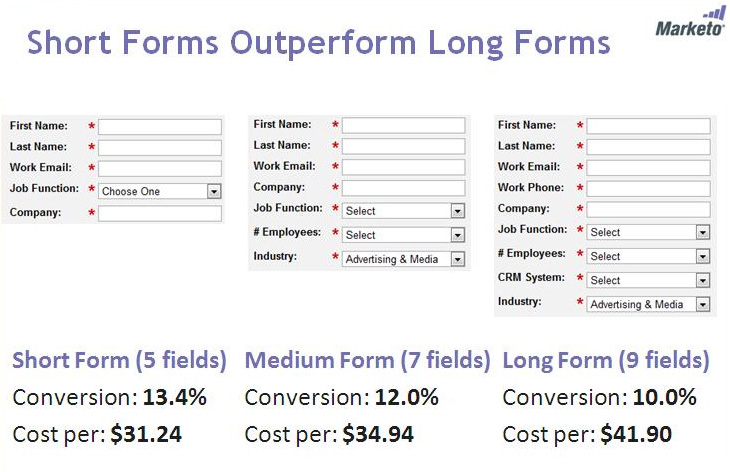
This has been addressed in a lot of sites but it’s still pretty common to see registration required before you can check out.
That doesn’t make sense: buying online should be easier than buying in real life, not harder. No store in the mall would ask you for your phone number and address before they’d hand over your goods and consent to take your money.
Online, it’s even crazier – that customer can just click their way to another store and buy what they want in moments. Up to 86% of customers said they would change their behavior if forced to create an account. Don’t give them a reason to leave!
Getting It Right:
Getting an email or asking for a registration does belong in the checkout – it just doesn’t belong in the pre-purchase part.
Don’t add friction here!
In a Jared Spool study, removing mandatory registration from a major e-commerce site contributed to a 45% increase in sales, translated to an extra $300m. When ASOS switched over to guest checkout as default and stopped demanding registration, they halved abandonment.
Wait until the customer has completed their purchase then ask for registration on the confirmation page. And don’t ask for something for nothing. Registration should offer some benefits – make this an email capture and sell it with offers, since that’s most people’s main reason for joining company mailing lists.
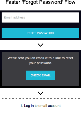
I Can’t Remember My Password
You signed up quickly, not really paying too much attention after you bought something. So it’s no surprise that when a carefully-crafted, accurately-targeted email encouraged you to return to take advantage of a killer offer or a new product line, you turned out to have – ahem – forgotten your password.
Since that’s actually a pain point, now would be an awesome time for an e-commerce site to offer to help you. But way too often, what really happens is you run into Checkpoint Charlie syndrome again. Klaxons sound, gates slam shut and you get stiff-armed away from the entrance. No password? No entry.
Getting It Right:
One popular solution to this is presenting a memorable information question at login if the customer declares they’ve forgotten their password or offering it if they enter an incorrect password. At registration, ask for a memorable answer to a ‘first dog/first car/favorite movie’ question from a drop-down and explain why it’s useful to the customer.
However, from a security point of view this isn’t optimal since memorable information is either far easier to guess than a password, or not much more memorable. Hints have the same flaw.
Since the email address is pretty much the gold standard in signup authenticity right now, it looks like we’re stuck with it. But forgotten password UX can still be improved. Try adding a ‘check email’ button to your password flows to make it easier and faster to get back into the account.
Payment
When a person literally is trying to pay you is no time to get in their way! Yet, many e-commerce shops pay so little attention to their payment processing that it feels like an afterthought. That doesn’t make any sense: the user is about to entrust you with their hard-earned cash. This is a moment to earn and appreciate that trust, not make them second-guess their choice and put obstacles in their way.
Get It Right:
Payment should be clear and simple: the easier the better. The ideal payment page is one page, auto-populating with delivery details and assuming that your delivery and checkout address are the same while flagging the issue in case they’re not.
Payment types should be visually recognizable, cart contents should be prominently displayed and the ‘pay now’ button should be unambiguous and easy to find.
Mobile
At this point even giving mobile its own category seems anachronistic. Mobile should be baked in – the needs of mobile shoppers should be considered at every step of the design process. Never more so than checkout.
Every issue we’ve talked about already is a thousand times worse on mobile: you’re up against smaller screens, more impatient shoppers and data limits that mean your customers are literally paying for each page.
That’s one more reason to have a simple, visual checkout page that’s only one page long.
Mobile shoppers won’t go through half a dozen checkout pages: they’ll check out the competition instead.
Maybe that’s why mobile cart abandonment is so high, at 97%. True, some of those shoppers are purchasing later on another device – but could you improve your checkout for mobile and get some of them to buy right now, on their mobile device? Ask Fallen Hero, who generated a 143% increase in mobile conversions by switching to responsive design. Yet, the attempt is rarely made and seldom done well. Baymard calls the average mobile checkout ‘seriously flawed’ and warns that it’s bad enough that ‘many usability issues are so severe that they will prevent users from completing their orders.’
Get It Right:
Optimizing checkout for mobile means taking account of screen size and new pages. One small, clear page is the ideal but it might not be doable.
Baymard identifies the most pressing issues in mobile checkout as being related to total order costs, account features and shipping. Form redundancy, lack of field descriptions and deficient error messages make the list too.
Start by making total order cost known as early as possible. That means before credit card data gets entered, before you ask about a delivery address and definitely before you ask for signup! Seems obvious – but 33% of the top e-commerce sites don’t tell you the total value of your order until you’ve entered credit card details.
Display shipping option details clearly. The alternative is for users to not know how much they’ll be charged for shipping or to have to memorize shipping details across multiple screens. The only thing mobile users hate worse than that is typing.
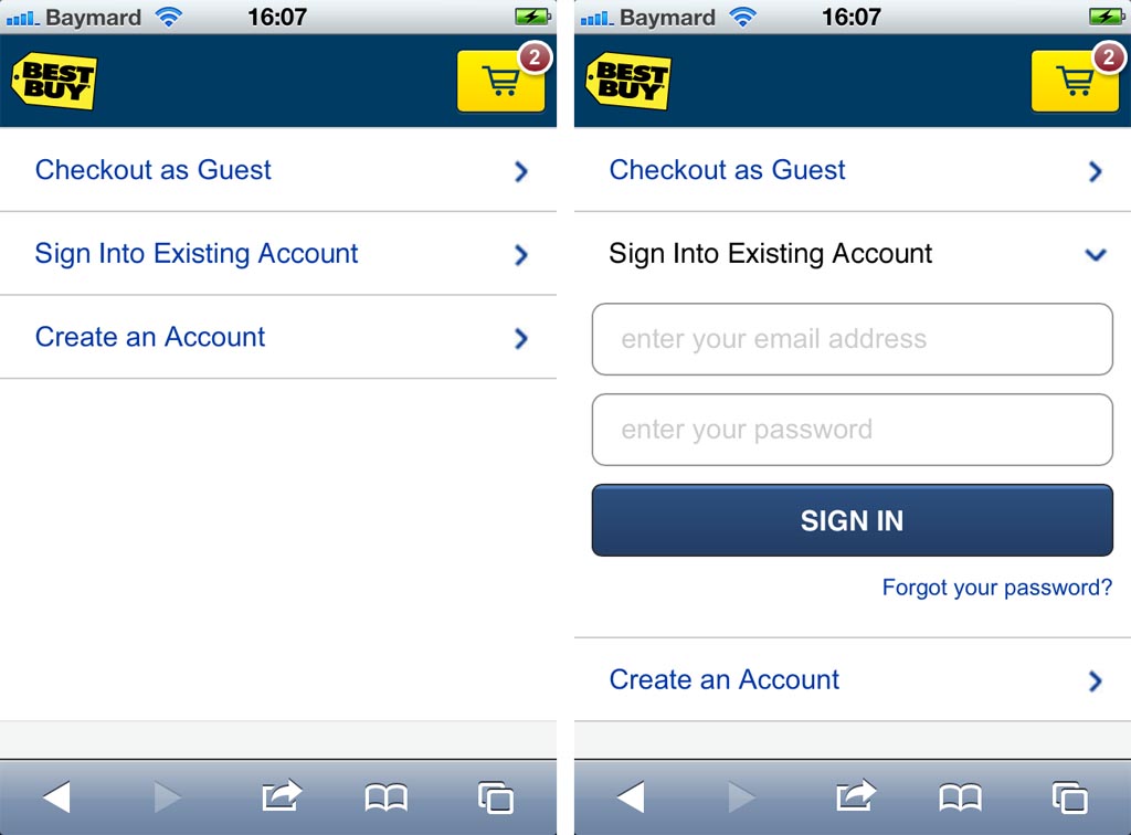
Foreground your guest account option. While the majority of mobile checkouts have a guest account option, it’s often so small that users can’t even see it and don’t know it’s there. Try showing them as collapsible fields instead so you can get all the options on the same page and give mobile users a choice.
Finally, make buttons usable! If your customers have to hunt for the ‘buy’ button that’s hidden in the corner of a screen in tiny writing and smaller than their thumb, they’re probably not going to bother.
No Guarantees
The moment when a customer decides to trust you enough to give you their cash isn’t just a crucial one for your business – it’s a scary moment for them.
They’re trusting you with the purchase price of their product, but what else are they trusting you with? Data, including credit card information, address, email, and phone number. Depending on what you sell, you could also be holding their plans for their weekend or holiday or wedding or backyard… when they hand over their cash they’re trusting you with a piece of their life.
Get It Right:
At that point in your checkout experience, you really need to be offering them some reassurance. Think of it like objection handling. The buyer has all these thoughts: what happens if my item gets lost in the post? What happens if it doesn’t arrive on time? What happens if… So address them right off. Don’t hide the good stuff in FAQs or documentation, way down among the little gray links at the footer that no-one ever reads. Your guarantees are marketing – use them!
Shipping Costs
OK, I saved the best til last. Shipping costs are the biggest checkout conversion killer of them all. In a 2014 survey, more than 145% of respondents listed shipping as their main reason for cart abandonment. That’s not a misprint: 50% said they abandoned due to lack of free shipping, 58% clicked away because of shipping costs and 37% said their main reason for abandoning was shipping and handling costs that weren’t listed until checkout. And 88% of consumers will actively search for e-tailers that offer free shipping. Shipping costs count out of all proportion to the dollar amount under discussion – three out of four online shoppers admit to buying more to nudge their purchase over the free shipping threshold.
Get It Right:
Make your shipping costs plain upfront so no-one ever hits the checkout, finds out they have to pay for shipping and handling. Free shipping is increasingly regarded as the norm, so if you can offer it you should.
Free shipping doesn’t affect consumers in the same way as very cheap shipping – it isn’t experienced as a reduced price but as an added value!
Whatever your shipping arrangements are, make them known, as early in the checkout process as you can. This helps assuage an important pain point, the worry people feel when they don’t know how much will be added to the price of their order before they can have their goods.
After The Checkout…
If your checkout is already super optimized with a smooth, easy, friendly checkout screen, free shipping and no password hassles, then two things: one, you should absolutely keep on optimizing the heck out of it, and two, you’re going to get cart abandonment whatever you do.
That’s why you should have some retargeting emails ready to go, which you can roll out to catch people who were treating their shopping carts as a ‘maybes’ pile, or whose purchase intent wavered at the final hurdle. These emails should be considered as an extension of your checkout experience, and they can be extremely effective.
Conclusion
Your checkout experience can be the place where you needlessly leak conversions or the place where you outperform the competition, sometimes massively. Users who have progressed as far as your checkout are interested in buying – we need to make it easy and rewarding for them.
About The Author:
Richard Bayston is a freelance blogger and copywriter covering tech, digital marketing and content strategy for SMBs. I’ve also been known to write on health and fitness. Find out more: Richard@RBCopywriting.com or @RBCopywriting. The rest of my time is spent arguing amicably with my wife and Googling the answers.
*Featured Image Source